Category: Design

The brief

Cancer Australia engaged 33 Creative to support the launch of Our Mob and Cancer, with resources development and copywriting, electronic newsletter distribution and media and stakeholder engagement around the launch.

Our Mob and Cancer is a website that provides culturally appropriate cancer information, resources and guidance for Aboriginal and Torres Strait Islander people impacted by cancer.

To support co-design of the site from its earliest development, Cancer Australia brought together an Aboriginal and Torres Strait Islander Expert Reference Group to provide expert advice and guidance on all stages of the website development and release.

Our Mob and Cancer Posters

Creative approach

We wanted to create a suite of resources that could be shared online, distributed in health clinics or shared through health stakeholder networks. We developed posters, social tiles, digital newsletters, and a stakeholder toolkit to support the launch of Our Mob and Cancer.

The resources feature artwork by Riki Salam, an artist and graphic designer and the digital designer of the Our Mob and Cancer website. Born and raised in Cairns on Yidindji land, Riki has connections to Muralag, Kala Lagaw Ya, Meriam Mer, Kuku Yalanji peoples on his father’s side and the Ngai Tahu people in the South Island of NZ on his mother’s side.

As of early 2023, community resources for Our Mob and Cancer have been rolled out and we look forward to seeing the continued growth of this important project!

Our Mob and Cancer feature artwork by Riki Salam Our Mob and Cancer social tiles

The brief

Cancer Australia engaged 33 Creative to support the launch of Our Mob and Cancer, with resources development and copywriting, electronic newsletter distribution and media and stakeholder engagement around the launch. Our Mob and Cancer is a website that provides culturally appropriate cancer information, resources and guidance for Aboriginal and Torres Strait Islander people impacted by cancer. To support co-design of the site from its earliest development, Cancer Australia brought together an Aboriginal and Torres Strait Islander Expert Reference Group to provide expert advice and guidance on all stages of the website development and release.

The brief

Philanthropic organisation the Paul Ramsay Foundation partnered with six First Nations project partners, to elevate Aboriginal and Torres Strait Islander voice, leadership and agency in education.

The program supports the six projects driven by Indigenous led education practices with a focus on language and culture in supporting education and youth success. ​

Paul Ramsay Foundation Brand Guidelines

Creative approach

We were pleased to be part of the program, bringing together the six partners to create a shared communications framework to share the impact of the projects individually and as a collective.

A key focus of the approach was elevating First Nations voices as leaders in education sovereignty to enhance the reach of projects and leaders.

The design approach also elevated the partner organisations in leading the work, supported by the Paul Ramsay Foundation. A partner pack was created to support a shared purpose, messaging and focus of the program wide communications, in conjunction with individual project communications lead by each organisation.

Paul Ramsay Foundation Partner Pack

The impact

The program announcement was a collaborative media release featuring each of the program partners and distributed to media nationally.

We worked with program partners and their agencies to support media pitching, supporting deeper coverage of the projects designed to promote Indigenous led education and influence more support for similar projects nationally.

We look forward to seeing the impact of the projects to support education outcomes!

Paul Ramsay Foundation Social Media Tiles

The brief

We were engaged by NSW Health to develop assets to promote oral health in the Aboriginal community. Our deliverables comprised of a poster, icons, videos, and an overall visual identity.

Oral Health Poster resource

The approach

To kick off the project, we organised an onboarding workshop with our talented creatives. After laying down the groundwork, we reached out to the community for their input through a series of online consultations, where we tested our messaging and received invaluable feedback.

With this feedback in hand, we honed our creative approach and produced two insightful videos – one highlighting how to access dental services and the other providing education on daily oral hygiene. We also created a visually striking look and feel for the campaign, complete with key icons and a poster featuring images from our shoot, along with bespoke illustrations that supported our messaging.

The brief

We were engaged by NSW Health to develop assets to promote oral health in the Aboriginal community. Our deliverables comprised of a poster, icons, videos, and an overall visual identity.

Australian Bureau Statistics (ABS) Aboriginal and Torres Strait Islander Brand Identity

The approach

33 Creative were engaged by the Australian Bureau Statistics (ABS) to develop an Aboriginal and Torres Strait Islander brand identity that aims to enrich the overall experience of First Nations people engaging with the ABS’s data and services.

33 Creative engaged two First Nations artists, developing the brief for creating a contemporary artwork that foregrounds Aboriginal and Torres Strait Islander peoples, cultures and experiences within Australia’s contemporary national story.

Each artist created an artwork that represented their culture and perspective on the ABS’s desire work more closely with Aboriginal and Torres Strait Island communities to tell their story of people and communities.

Oral Health Poster resource

The impact

33 Creative facilitated the combining of the artworks and worked in partnership with both artists along the way to ensure their story was as they intended.

The resulting, ‘Our Story. Our Future.’ was created by Wiradjuri, Wotjobaluk, Yuin and Gumbaynggirr artist Luke Penrith, and Maluililgal people, Badu Island artist Naseli Tamwoy.

The artwork celebrates Indigenous stories as highly visible for the benefit of future generations. It embraces the cultural importance of storytelling and information sharing, entwined with a focus on working together for a strong future for children, family and community.

The use of colours and inclusion of country, land and sea, rivers and desert, reflects the diversity of Aboriginal and Torres Strait Islander peoples and cultures across the continent. Individual motifs are featured in icons to enhance visual representation of key concepts within the ABS work.

Using the finished artwork piece, 33 Creative further developed brand concepts as well as brand guidelines which showcased the brand’s application across a range of reference materials. The resulting brand has been implemented across the ABS work to engage First Nations communities, including in the 2021 National Census campaign.

Learn more about the final brand and artwork story here.

The brief

Cancer Australia engaged 33 Creative to support the launch of Our Mob and Cancer, with resources development and copywriting, electronic newsletter distribution and media and stakeholder engagement around the launch. Our Mob and Cancer is a website that provides culturally appropriate cancer information, resources and guidance for Aboriginal and Torres Strait Islander people impacted by cancer. To support co-design of the site from its earliest development, Cancer Australia brought together an Aboriginal and Torres Strait Islander Expert Reference Group to provide expert advice and guidance on all stages of the website development and release.

The brief

Philanthropic organisation the Paul Ramsay Foundation partnered with six First Nations project partners, to elevate Aboriginal and Torres Strait Islander voice, leadership and agency in education.

The program supports the six projects driven by Indigenous led education practices with a focus on language and culture in supporting education and youth success. ​

The words

Knowing this campaign required a bolder, braver approach, we pitched a theme that responded directly to complacency and tokenism, with the words:

“More than a word. Reconciliation takes action.”

The aim was to encourage Australians to commit themselves to the movement, emphasising that reconciliation can only be achieved through meaningful reflection, dialogue and action.

Bringing the notion of reconciliation into tangibility, this year’s theme is about action. It takes sincere engagement and quantifiable action to truly begin to reconcile. It also takes truth telling. And listening.

The art

Responding to the client’s preference for a bright, bold visual approach, we worked closely with Warumungu/Wombaya artist, Jessica Johnson, who developed the incredible artwork for 2021. This was a highly collaborative process that allowed Jessica’s art to be integrated appropriately by our design team across various materials (including an animation) without losing its meaning or heart.

Jessica’s work for NRW2021 tells the story of the land and community sharing a united call for action on reconciliation.

“With their rainbow shaped souls the spirits ask for us to join and make reconciliation more than a word, take action” – Action by Jessica Johnson

The impact
The theme ‘More than a word. Reconciliation takes Action’, has been shared across a number of design assets including an animation which was broadcast nationally on TV and online.

About NRW
Each year, NRW takes place from the 27th March to 3rd June. These dates are significant in that they commemorate milestones for Aboriginal and Torres Strait Islander people.

May 27th marks the anniversary of the 1967 referendum whereby Aboriginal and Torres Strait Islander people were constitutionally recognised in the Census. June 3rd marks the 1992 date of the High Court’s decision to overturn the legal doctrine of terra nullius, which in spite of 65,000 years of Indigenous custodianship – defined the Australian continent as ‘uninhabited’. This event is often referred to as the ‘Mabo decision’ as it took place as a result of the work of Eddie Mabo, a Torres Strait Islander man whose campaign work and legacy remain instrumental to date.

So where to next?
National Reconciliation Australia have compiled 20 actions for reconciliation. Visit the official NRW 2021 site for more information.

Click here to watch the video, or visit here to download posters, social assets and other resources for NRW.

2022 Indigenous Business Month

Background

33 Creative, together with Dr Michelle Evans of the MURRA Indigenous Business Master Class Program and Leesa Watego of Iscariot Media and their teams, led another successful Indigenous Business Month in the month of October. The theme for the 8th Indigenous Business Month was “Actions Today, Impact Tomorrow” which called upon First Nations business owners and non-Indigenous allies to gather online and in community to look at our actions today and how they impact our tomorrow.

As business leaders, we wear many hats. Inspiring the next generation of business leaders is one – what we say and do today in our communities could be the spark that inspires our businesses of tomorrow.

2022 Indigenous Business Month social tiles

Indigenous Business Month Awards

2022 saw the highest number of award applications in the last three years and a particular growth in the number of Regional Indigenous Businesses getting on board.

This year’s winners were:

Indigenous Business Month is about shining the light on those that are doing amazing things. We encourage everyone to get across the activity of this year’s award winners and keep an eye to other Indigenous Businesses achieving remarkable things. As Indigenous Businesses we should recognise, value and reward our Actions Today, having positive Impact Tomorrow.

Visit the Indigenous Business Month website for more information and follow our #IndigBizMonth socials – Facebook, Instagram, Linked In and Twitter to keep up to date on #IndigenousBusinessMonth

Indigenous Business Month Awards

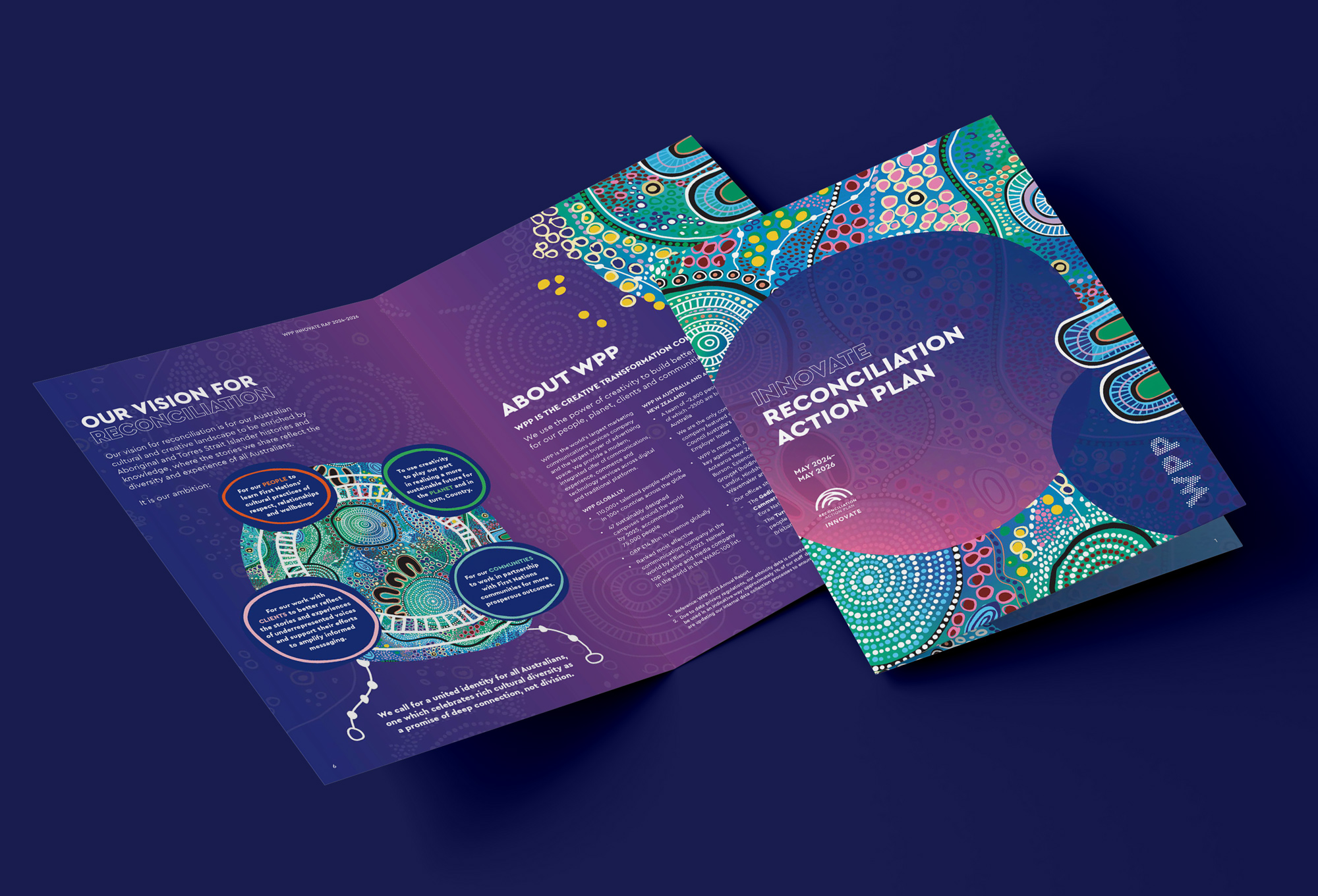
WPP Innovate RAP 2024-2026

Our brief

Create the next embodiment of  global creative transformation company WPP’s Reconciliation Action Plan (RAP).

In 2021, WPP approached 33 Creative to assist with producing their first RAP. The company were thrilled with the outcome and in 2024, we heard from them again. This time, they wanted to go a step further.

For the 2024-2026 RAP, WPP was committed to continue their journey towards reconciliation, and increased their commitment to Innovate status.

So we countered, and briefed in the very same talented artist that created their 2021 artwork, Jordan Ardler to go further in her creative exploration. Jordan is a member of the La Perouse Aboriginal community and she identifies with the Bidjigal Clan group


Our Mob and Cancer feature artwork by Riki Salam

The artwork

“INNOVATE” by Jordan Ardler, Acrylic on Canvas

Innovate is a symbolic and meaningful interpretation of the many points of connection and collaboration WPP nurtures. Always being open to progress, acknowledgement of the journey taken and to come and the importance of our connected partnerships with our people, the planet, our clients and communities.

The ever changing flow of colour follows two journey stories. The first, through the ocean waters of the Pacific, Indian and Great Southern Oceans, supporting the connection between our Australian and Aotearoa New Zealand bases. The second, a representation of the day and night skies, connecting us from above.

The moon is represented top right, in the dark red section. Jordan’s interpretation is that it doesn’t matter where you are, you can look up and see the moon, which connects us all. The centre circle in a similar style, represents the sun, giving life and light from above.

There are two circle motifs, edged by four people (U-shape) each representing Australia and Aotearoa New Zealand. There are many connections between these symbols, including the white lines with dots at regular intervals. This line design describes the aircraft flight path.

WPP Innovate RAP 2024-2026

The outcome

WPP’s Innovate Reconciliation Plan 2024-2026 is an important document that will influence over 2500 employees in Australia and New Zealand to continue with their journey, and to strive towards ambitious goals:

  1. For our PEOPLE to learn First Nations’ cultural practices of respect, relationships and wellbeing.

  2. To use creativity to play our part in realising a more sustainable future for the PLANET and in turn, Country.

  3. For our work with CLIENTS to better reflect the stories and experiences of underrepresented voices and support their efforts to amplify informed messaging.

  4. For our COMMUNITIES to work in partnership with First Nations communities for more prosperous outcomes.

Global creative transformation company WPP approached 33 Creative to assist with producing their reconciliation action plan (RAP). Our role was to project manage the process, including engaging a First Nations artist for the project as well as design the RAP booklet ahead of its roll out.

In addition to project management, our biggest value-add as an Aboriginal agency, was in our knowledge sharing and facilitating guidance that helped WPP shape and appropriately communicate and commit to their reconciliation plan through engaging, informative, and accountability-led collateral.

Our Mob and Cancer feature artwork by Riki Salam WPP Innovate RAP 2024-2026

The artwork

“INNOVATE” by Jordan Ardler, Acrylic on Canvas

Innovate is a symbolic and meaningful interpretation of the many points of connection and collaboration WPP nurtures. Always being open to progress, acknowledgement of the journey taken and to come and the importance of our connected partnerships with our people, the planet, our clients and communities.

The ever changing flow of colour follows two journey stories. The first, through the ocean waters of the Pacific, Indian and Great Southern Oceans, supporting the connection between our Australian and Aotearoa New Zealand bases. The second, a representation of the day and night skies, connecting us from above.

The moon is represented top right, in the dark red section. Jordan’s interpretation is that it doesn’t matter where you are, you can look up and see the moon, which connects us all. The centre circle in a similar style, represents the sun, giving life and light from above.

There are two circle motifs, edged by four people (U-shape) each representing Australia and Aotearoa New Zealand. There are many connections between these symbols, including the white lines with dots at regular intervals. This line design describes the aircraft flight path.

The Atlantic Fellows for Social Equity Communication and Brand Strategy

Global creative transformation company WPP approached 33 Creative to assist with producing their reconciliation action plan (RAP). Our role was to project manage the process, including engaging a First Nations artist for the project as well as design the RAP booklet ahead of its roll out.

In addition to project management, our biggest value-add as an Aboriginal agency, was in our knowledge sharing and facilitating guidance that helped WPP shape and appropriately communicate and commit to their reconciliation plan through engaging, informative, and accountability-led collateral.

2022 Indigenous Business Month social tiles

The brief

The brief was to create a unique and meaningful look-and-feel that fomented the brand while celebrating First Nations people, our cultures, and our capabilities. In doing so, 33 Creative worked closely with Gunnai, Gunditjmara, and Yorta Yorta fashion designer, Lyn-Al Young, who designed the beautiful artwork featured throughout, representing AFSE’s journey. Lyn-Al’s piece was originally created as a scarf, then photographed and used as the brand’s focal piece. The artwork and its incorporation into design assets has been warmly received by AFSE’s staff, broader community, and stakeholders, quickly becoming synonymous with the organisation’s recognisability.

The artwork

“INNOVATE” by Jordan Ardler, Acrylic on Canvas

Innovate is a symbolic and meaningful interpretation of the many points of connection and collaboration WPP nurtures. Always being open to progress, acknowledgement of the journey taken and to come and the importance of our connected partnerships with our people, the planet, our clients and communities.

The ever changing flow of colour follows two journey stories. The first, through the ocean waters of the Pacific, Indian and Great Southern Oceans, supporting the connection between our Australian and Aotearoa New Zealand bases. The second, a representation of the day and night skies, connecting us from above.

The moon is represented top right, in the dark red section. Jordan’s interpretation is that it doesn’t matter where you are, you can look up and see the moon, which connects us all. The centre circle in a similar style, represents the sun, giving life and light from above.

There are two circle motifs, edged by four people (U-shape) each representing Australia and Aotearoa New Zealand. There are many connections between these symbols, including the white lines with dots at regular intervals. This line design describes the aircraft flight path.

We also delivered their first public call for applicants to the program, working with First Nations media across Australia and New Zealand to reach community members through a series of editorial case studies that supported the digital advertising executions; this in turn drove people to the website and helped to elevate their overall presence ahead of building on the growing network of Fellows.

AFSE is several years in operation and continues to go from strength to strength. We are proud to have played such an important role in helping to develop and establish the brand and platforms for communicating what is truly an amazing initiative.

The brief

Cancer Australia engaged 33 Creative to support the launch of Our Mob and Cancer, with resources development and copywriting, electronic newsletter distribution and media and stakeholder engagement around the launch. Our Mob and Cancer is a website that provides culturally appropriate cancer information, resources and guidance for Aboriginal and Torres Strait Islander people impacted by cancer. To support co-design of the site from its earliest development, Cancer Australia brought together an Aboriginal and Torres Strait Islander Expert Reference Group to provide expert advice and guidance on all stages of the website development and release.

The brief

Philanthropic organisation the Paul Ramsay Foundation partnered with six First Nations project partners, to elevate Aboriginal and Torres Strait Islander voice, leadership and agency in education.

The program supports the six projects driven by Indigenous led education practices with a focus on language and culture in supporting education and youth success. ​

Creative approach

We were pleased to be part of the program, bringing together the six partners to create a shared communications framework to share the impact of the projects individually and as a collective.

A key focus of the approach was elevating First Nations voices as leaders in education sovereignty to enhance the reach of projects and leaders.

The design approach also elevated the partner organisations in leading the work, supported by the Paul Ramsay Foundation. A partner pack was created to support a shared purpose, messaging and focus of the program wide communications, in conjunction with individual project communications lead by each organisation.

Paul Ramsay Foundation Partner Pack

‘Walking Together’, 2022 (Acrylic on Canvas)

Josh tells the story of the artwork in his own words:

“Walking Together highlights the Foxtel Group’s commitment to walk alongside Aboriginal and Torres Strait Islander peoples for reconciliation. The concentric circle in the middle with the ‘U’ shapes surrounding it, is a traditional symbol representing a campsite, meeting place, sacred site or community. For this artwork, the meeting place is representative of the Foxtel Group. The chosen colours connect with our businesses: Foxtel, Kayo, BINGE, Fox Sports and Foxtel Media. The significance of a circle is that everyone is welcome, everyone has a place, and everyone is treated equally. The handprints symbolise teamwork, working hand in hand, and also individuality as no one’s handprint is the same. The footprints are a reminder of the journey and commitment of walking together in the hope of true reconciliation. The four orange patterns and lines in the background symbolise the flow of energy and connection – our connection to each other, connection to experience and our connection to mother earth.”

– Josh Sly

Paul Ramsay Foundation Social Media Tiles

The RAP team at Foxtel engaged with the project and process wholeheartedly, trusting the team at 33 Creative to deliver a memorable project with storytelling at the heart of the creative process as well as the RAP’s design outcome.

The RAP was printed using PEFC accredited stock and distributed to all of Foxtel’s employees home addresses, reflecting the group’s integrative approach in committing to its objectives.